Welcome

This website will try its best to introduce the reader to the NYPD Motor Collision Dataset. To the interested an iPython Notebook can be found here. The purpose of this site is to give you an intuition regarding the motor vehicle incidents in the Big Apple, New York City.
If you take a look to your right you can find the data to download and fiddle around with, and below you can see some results of analysis of said dataset, along with data of the weather in NYC and population densities in NYC.
The iPython Notebook linked above holds information on the data analysis as well as code to replicate it. We hope you enjoy.
Link to repository containing files for website.

The Data

The NYPD Motor Collision Dataset is an open data set about collisions in NYC from the 1st of July 2012 until the 31st March of 2017, avaliable here. The data is continously updated, but for this web page only the given interval is included.
A long with this, weather data from National Centers of Enviromental Information under NOAA, the National Oceanic and Atmospheric Administration, will also be presented, avaliable here. We have included the same period for the weather data as the collision data.
Finally also a data set over population densities is used, avaliable here. Similarly shape files of the NTAs in NYC can be found here. Mapshaper.org has been used to convert these shape files into TopoJson files.
Overview

First we would like to give an idea about the NYC Collision data set. To the right an interactive graph is shown, and feel free to scroll through the set. This graph shows the daily amount of incidents all over NYC in the period from 1st of July 2012 to the 31th of March 2017. Zooming in on big holidays like New Year or Christmas, then contrary to our initial assumptions, these days was actually quite normal if not lower than the mean. Going to the 21th of January 2014 we see a HUGE spike. A quick google can then reveal a snow storm unveiling around in NYC. Here an idea can be made about how the weather can inflict the amount of collisions which we will return to later.
To get the bigger picture we will have to look distribution, but for now just enjoy a beautiful graphical illustration.

Data distributions

Since plotting all the dates was quite incomprehensible, we have instead plotted five different distributions below (Use buttons to switch between them).
First we see the yearly development of incidents, where ones first thought would be, "Why are 2012 and 2017 so low?", but this is due to the fact that their data are not complete. Nevertheless we can see that the tendenses in collisions are growing slightly year after year, but with only 4 years avaliable, and such small shifts it is hard to conclude anything.
Next up we have incidents per hour. This distribution shows the incidents for each hour over all the years, which shouldn't be too surprising. We see the peaks accurs during rush hours in the morning, around 8am, and the afternoon, around 4pm. But next up we want to split this up in how many incidents have people been injured and have died.

Not too surprising the amount of injured follows the amound of incidents quite well. To get a feel of this click on the the buttons right after eachother and watch the smooth and delicous transformation in the graph.
Interestingly this isn't the case for incidents where deaths are included. Here we see that during midday, 7am - 5pm, the amount drops a lot relatively to the rest of the day. Especially early morning has a big rise where 4am tops the deal.
The last distribution covers the indident causes. It should be noted that "unspecified" causes has been removed from the data set, which was over a million incidents. But given the large amount of data, the plot should give a good idea of the cause distribution either way. We see that "Driver inattention/distraction" takes a clear number one, which is not too surprising since it's a broad definition.
Now we have build a bit of understanding of the data set over time, and will now move on to the spatial domain.

Spatial understanding

So does the location have any effect on the amount of incidents? To the right another interactive plot has been made over NYC, where zooming, panning, and pointing for information is possible.
Initially we see a plot over the population per square kilimeter in NYC, where the darker the color the bigger the density. Not surprising, Manhattan has the biggest density of population where Yorkvile wins first prize. By clicking the button below the graph, it should change to the amount of incidents per square kilometer. Here it should be noted the amount are over the full period, which can be read in the graph title.
It's interesting to see how the density of incidents changes from middle/northern Manhattan to southern Manhattan, which is most probably due to the fact that southern Manhattan is the hot spot regarding workarea and seightseing.

Bike or walk?

Have you ever wondered - should I take my bike to work or should I walk?
You might've thought that you should consider things like the weather, travel times etc., but what about the statistics?
Here you see a map which holds the statistical evidence on whether you should walk or bike depending on where you are.
The map is based on history and on how many accidents have happened before. The idea is that you should look at where you are on the map, and if you're in a 'green zone' then the data shows that most of the accidents around you - the 36 nearest observed to be precise - in which a person has been injured or killed in a car accident has been a pedestrian On the other hand - if you're in a 'red zone' then most of the accidents around you (still 36, to be precise) in which a person has been injured or killed has been a cyclist.
Thus if you're in a red zone you're better off by foot, whereas if you're in a green zone you're better off on bike.
The method used here is a classic in Machine Learning - K-nearest-neighbor classification in which the algorithm predicts a certain class based on similar objects. Here we simply use location to train the algorithm and predict a grid over New York City.
Overall, the data predicts that you're safer by bike on Manhattan and safer on foot in Brooklyn.

Using decision trees

To look at some unusual statistics we have decided to train an alternative prediction model. We have used a decision tree, which we will illustrate below, to predict the following.
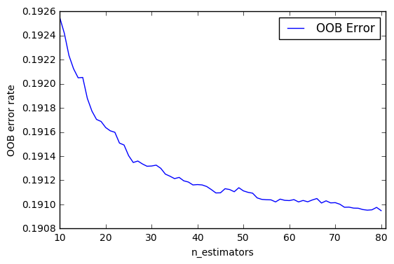
Given that you are in an accident, how does the weather and time of day affect the outcome of your involvement. Will you come out safe, injured or dead? To be more frank we trained a random forest classifier, where a the graph to the right, indicates how well our prediction work. Leaving out the juicy, but complex stuff, the graph to the right shows that with we can predict the outcome of your invovlement with a nearly 81 percent certainty.
A small but fun illustration of how decision trees works can be seen below. This is a VERY simplified version of ours, but gives an understanding. Each node in the graph indicates a yes or no decision. If true you move up, and false you move down. Each not gives a question which you have to answer, and when you have reached the end, the certainty for each outcome will be shown. Try opening the nodes by clicking on them to get the feel.

some text

Thank you

We hope our presentation and vizulation has improved your understanding of trafic collisions in NYC.